Posts

Response on Trash Mountain

I read Trash Mountain as this week’s webcomic. The plot is very surreal and a bit confusing to understand. I wonder what is the meaning behind the frequently used symbol in the story - the equilateral triangle. I personally think the theme is about going back to nature. On the first page, the main character gets nude and meditate n nature about modern living. In the end, he breaks the tube on the male statue of the dystopian city with his own happen. I feel like this is a message telling people to break the barrier of modern civilization and back to nature. Besides the confusion with the plot. I actually enjoyed reading it. It is the first comic that I’ve seen that uses animated Gif within the panels. I really enjoyed the part where the protagonist falls from the sky into the underground that travels between pages of the comic in animation. I feel like it is a revolutionary way of storytelling. I could see gif comics being an entirely new artistic genre of the future comic. It is lik

Respons on The Killing Joke

My strongest reaction towards this comic is the understanding and perhaps empathy towards Joker's character. I didn't know the humanity hidden behind Joker's smiling mask before reading this. I think the core of the story is about how the Joker wanted to recondition in the society. How an average man could turn to the dark side because of being mistreated by the reasons of the world, and perhaps by their own mistakes. The Joker thinks going crazy is the only way out to escape from his tragic past and to rebel against the unfairness of society. He desperately wants to prove that he isn’t the only one, that others could be the same as him if they have the “bad day”. However, he is alone. Bruce Wayne and James Gordon all had the “bad day” while the Joker is the only one who has lost his sanity. When the Joker commits the brutal crimes towards Gordon, I see a man who desperately wanted to be recognized instead of a crazy villain. But nobody in the story could understand him, o

Response on Pretty Deadly

I chose to read Pretty Deadly because the cover page on chapter one caught my eye at first glance. At first, I was a bit confused about the conversation between the butterfly and the bunny since the bunny was being shot in the head as the conversation goes on. However, after reading the first chapter and continuing one to the second chapter, I understood that they are the narrators of the story. I feel like it is an interesting way of narration. It fits with the fable-like, rhyming narrative that is also used in the comic.   However, I didn't fully understand the plot after reading the first two chapters, so I continue to read until chapter four. I still have a lot of questions about the rules of the world in the story and the appearance of some characters. Despite the confusion, I still enjoyed reading it. The storyline is very interesting with a lot of mysteries that keep me reading. What I enjoyed the most is the art style. The color palettes used in the illustrations are v

Comics as Contemporary Literature

Image
For comics as contemporary literature, I read Asterios Polyp and the two versions of Sandman. I was very into Asterios Pop's narrative style. I love its narration by using simple text and geometric designs. The color combination is also very harmonious. My favorite page is when Asterios is introduced, he was alone while the panel is alone on the page too. It really help me to focus on the panel and the loneliness. I think this is the kind of appeal that words cannot produce. I also read the Sandman from DC comics and the Sandman The Dream Hunters illustrated. I chose to read these two because I wanted to make a comparison between the "Eastern" and "Western" approach of the Sandman from the same author. The DC Sandman is very interesting in the way that different sides of humanity are being portrayed into personified concepts of characters. I like the way of the narrative and the dialogues used in the comic. On the other side, Sandman the Dream Hunters h

Response on Manga

Tezuka I chose to read some of Astro Boy and the first volume of Buddha. At first glance, I could see the mixture between Tezuka's style and the influence of western cartoons. I felt like the style is quite different against today's popular mangas which has a different way of expressing exaggeration. I also noticed that there is a great difference between how the environment is drawn and how the characters are drawn. The environments are drawn and shaded realistically while the characters stayed very dramatic with a black outline separating them from the environments. It reminds me of when I read understanding comics, it says that Manga tends to make environments more realistic and characters more simplified for us to relate to the characters' emotions. This technique is later applied to a lot of Anime that I've seen, for instance, Attach on Titan has a dark outline around the characters separating them from the environment. Manga I started reading Manga since el

Response on Persepolis

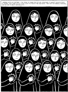
Image
I like the point of view and the visual language of Persepolis. In Persepolis, the POV is focused on Marjane herself, making her the main character growing up from childhood to adulthood in the times of war. I like it because it is much more impactful and also entertaining to see the effect of war and pressure of society form a young girl's point of view than history books. It reminds me of the feeling of reading "The Diary of Anne Frank". Both characters are telling their story of living in wartime and from oppression by their leaders. Persepolis let me understood a lot about Inequality, and lack of freedom, and especially women's rights at the time period. The strong visual and verbal representation used in the graphic novel is very impactful to me. Visually, I found this panel in page 95 is very impactful. The composition is repetitive, enhancing the fact that every woman is forced to be the same. The mass amount of black used in the image creates a depressi

Response on American Born Chinese

Image
The first thing I noticed while reading "American Born Chinese" is that the design language is very graphic and easy to read. It is very interesting to read the monkey king's story with this visual style. The version of the "Monkey King" that I used to read as a kid was something like this: The format is called "小人书", which basically is comic strips printed in a palm-sized book. After I read further into "American Born Chinese", I felt like a lot of connections were made between the protagonist's experiences and my own. I was born in China and had my education in a Chinese local school until elementary third grade. Afterward, I was transferred to an international school in which all the teachers and curriculum are in English. A a few years later, I moved to the US. I always had the feeling that I was stuck between the two cultures, In the US, I am unable to understand many aspects of the American pop culture, and In China, I